
Review: New Dailymotion Redesign & Branding
A look at the new Dailymotion redesign and branding for 2015.
Dailymotion was launched back in 2005, from the living room in Paris of one of its partners.
It's one of the biggest video hosting platforms on the web, at one point it was the biggest competition to YouTube in the golden ages of web video.
Obviously, YouTube has become a titan in the space and even though Dailymotion might be the second largest in terms of viewership, it's a very far 2nd place.
The service boasts 300 million viewers on its player and 30 billion video views worldwide per month.
It's nowhere near as mainstream as YouTube and doesn't have the exclusive, cool hipster factor of Vimeo, Dailymotion falls somewhere in between the two.
They've now started to reveal the new design across the entire platform including the site, app
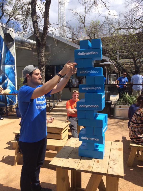
It appears they timed the release of their re-branding efforts with SXSW 2015.
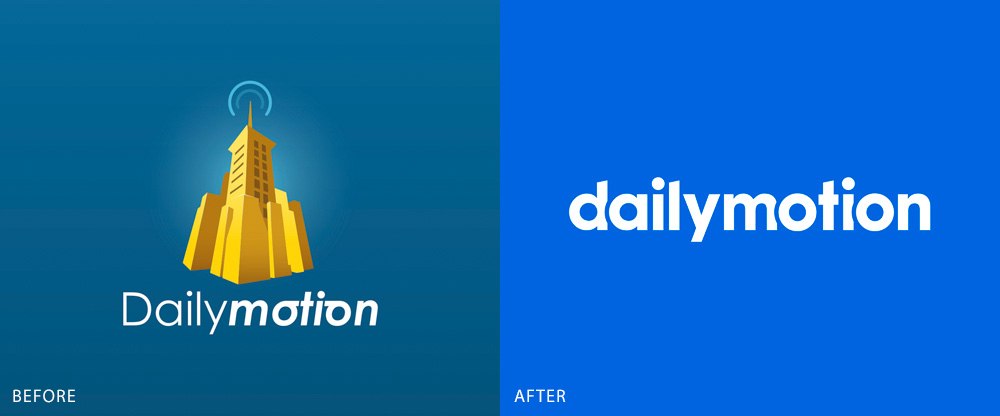
Let's talk about the old Logo
The text for the old logo was fine, but I was never a fan of that tower icon, it just looks so old school, which in many cases isn't a bad thing but in this case it is.
The New Logo
It's OK, I like the the overlapping “o”and “a” with the exception that it does start to run into issues when it's scaled down to smaller sizes, this however not a problem when it comes to retina displays.
They've also gone with the now very predictable flat design route, their top bar has a very loud royal blue that leaves a lot to be desired, I'm not a fan of that blue at all.
From Press release
A refined and simplified logo is supported by a brightened colour palette and clean graphic style. Working with the dailymotion design and UX teams, v3 extended these core design principles across the full user experience, including brand architecture, iconography, typography and tone of voice.
Over the past couple of weeks, Dailymotion has been hinting at a new design, I first noticed signs of it when they placed that options panel on the left of the website to help drive more engagement.
I didn't find it very useful and aesthetically pleasing at all because it looked out of place.
It appears the job isn't done though, because as far as the website goes, the rest of the design is still the same.
It doesn't really appear to be a video site that's operating in 2015, still very old school.
I like the player though

Dailymotion has always had a nice player, my issues with the old player were more on the development side with it not being as accessible and customizable as the YouTube player.
That being said they've been many changes recently and the player is much more open.
The new player is very sleek, sporting a dark play bar that hides once the video starts playing and returns on mouse over.
It's very easy to change the colors to match your site as well or if you want to play the videos in your own player, that's also fairly simple now.
The player is a winner.
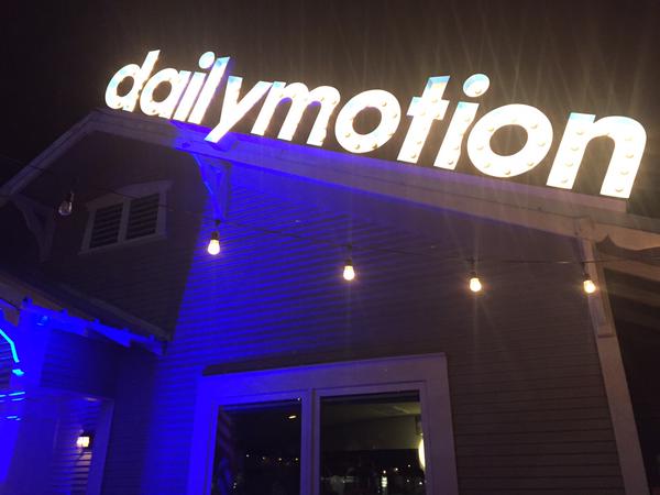
The logo looks nice over images
Though I have my issues with the logo once you start to scale it down, the typography does work well as an overlay on images, which you can view below.
The app icon could use some work
That generic “d” on the blue background doesn't say unique at all and is hardly recognizable.
What they should have done, is take the tower from the old logo, minimalize it and make it more of an abstract icon that has remnants of the old tower but has clearly been upgraded.
That would've been perfect for an app icon.
New brand introduction
Conclusion
Overall I think the new design was poorly executed, the new branding seems incomplete. Then there's also the video games part of Dailymotion that has a much more sleek design than that of the main site.
What they should do, is make the entire site have that design aesthetic.
The only thing I really love about the new branding is player, beyond that – the design just doesn't make the site seem like it's trying to compete in a space that has two very powerful competitors in the form of YouTube and Vimeo.
They're not playing in the year of 2015.